What To Wear To Your Session
After making the tough decision to find the perfect photographer, now comes a even more difficult process - outfit planning. I’ve been through it so many times with my own family and know just how important and stressful it can be. Which is why I’ve created this guide to help you understand which colors go together best, what colors and patterns to avoid, and even more tips. Looking your best is part of the formula for amazing photos!
First things first - colors & patterns to avoid:
Black: I don’t necessarily hate black, but I do hate too much of it. One person in black is okay but everyone (or mostly everyone) will cause too much blending and make the images look flat.
Neon & Bright Colors: These colors stand out entirely too much and will direct the focus straight to it. Not only is it distracting, it can also cast colors onto people and objects, which creates a mess of a image that editing can’t always solve. Always avoid bright & neon colors.
White: White is such a difficult color, while it may seem neutral it can actually make the person wearing it look very over exposed and bright. White also has a tendency to photograph more blue which takes extra editing to fix. Opt for cream or off white instead as it is more subtle.
Patterns & Logos: Please, stay away from logos (unless its a branding session) they are very distracting and tacky! Some patterns are okay, but two people wearing different patterns is very distracting and confusing to the eye. Try to have one person in a pattern, only two in similar pattern if you have a larger group. I will be going over patterns below.
Furthermore: If you ever have a wardrobe question, just ask me! You also do not have to follow my advice, these are your photos, so make them what YOU want.
Color Schemes & Inspiration:
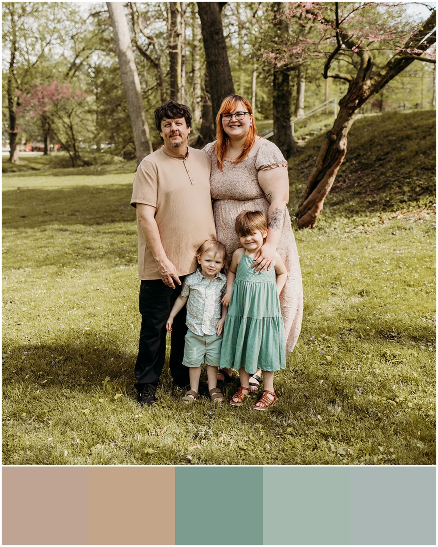


Pastels & Spring colors are a great option for spring and summer months. Sage green, muted pinks, light blues, etc. Fill in with creams, off whites, & textures. Notice the textures in each photo. Smaller families only have one pattern, where as the one bigger family has two patterns that are not the same. It isn’t my favorite but it also doesn’t look terrible. Also notice in the third image how the mom is wearing floral and the daughter is wearing lace, this is a fantastic combo. Lace is a very blend able texture and can go along side other textures and patterns so effortlessly!
Notice the hint of black in the man’s pants in the first photo & the shirt in the fifth photo? It isn’t overwhelming and can help blend. Khakis & Jeans are always a great option especially with lighter colors. Personally I would have swapped each for a more neutral color BUT it’s all about personal preference and vision.

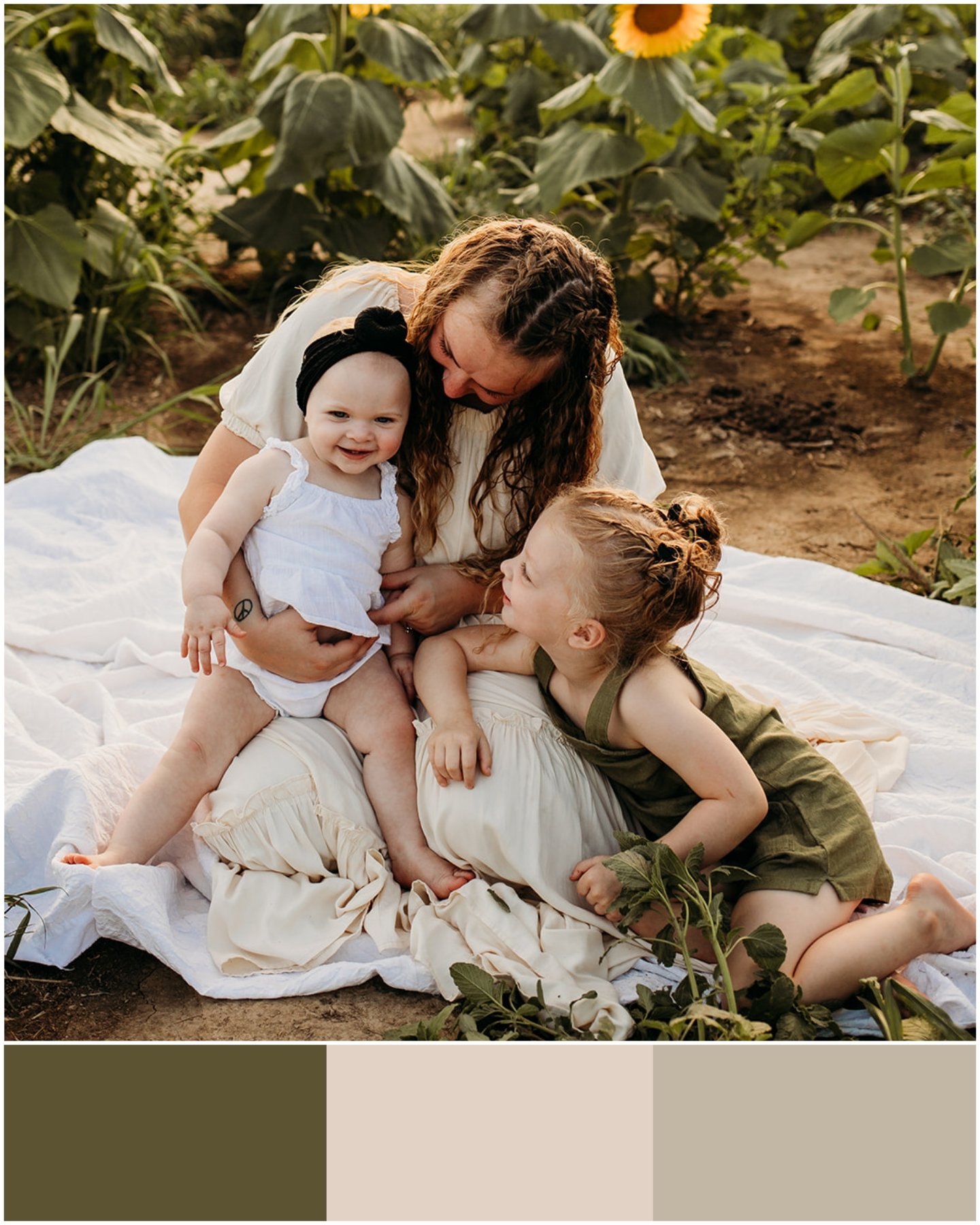


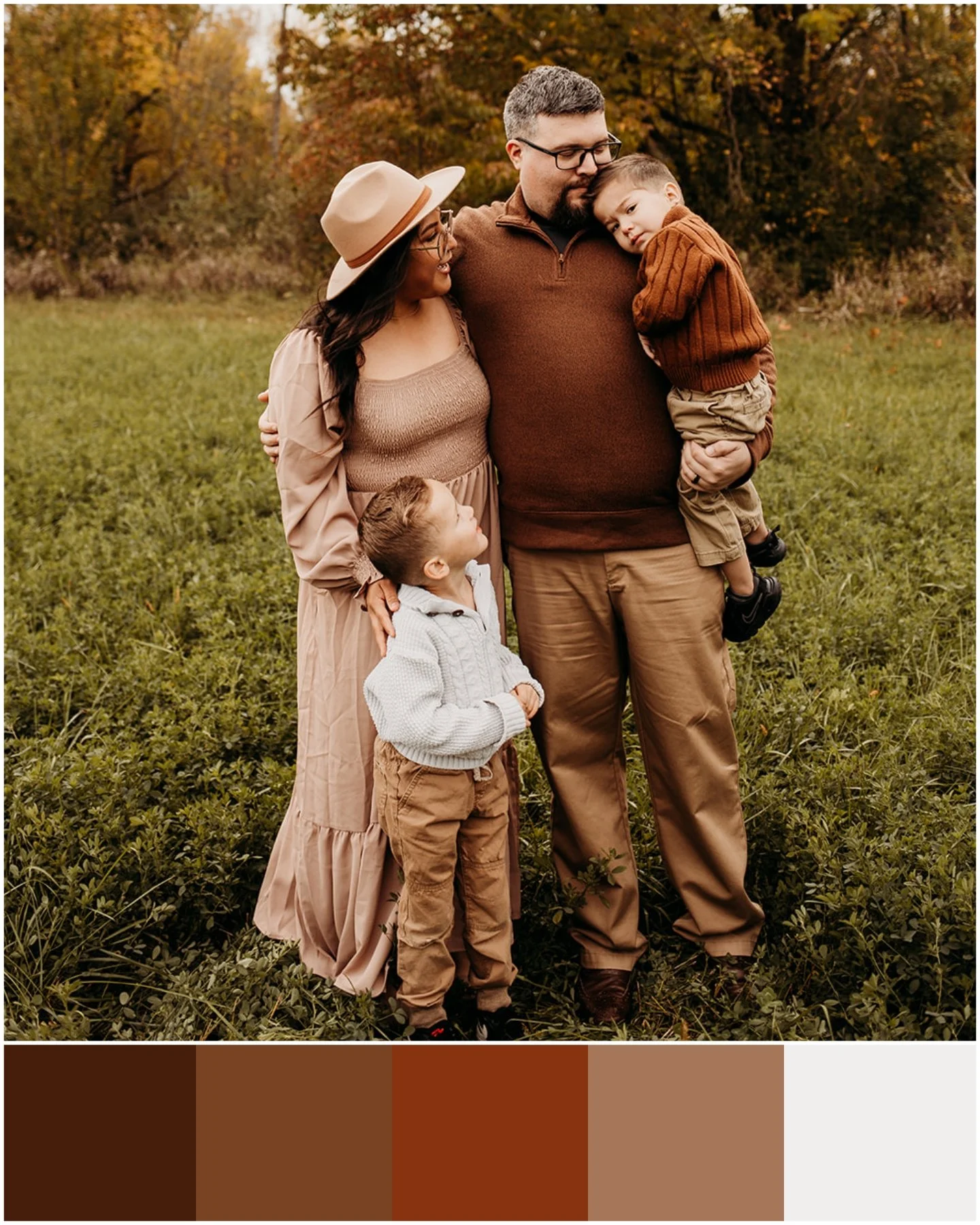
Muted deep earth tones are so pleasing and versatile. I love the simplicity of olive green mixed with cream, brown, or beige. It blends so well and fits any setting. Any of these color combos work great and are a great guide if this is your style.
Notice the patterns in the first photo? They are different but they do not look terrible together.
Notice how baby is in bright white in the second photo? She is much brighter than anyone else in the image, opt for cream or off white instead if possible!
The last photo, baby is wearing a bright color which results in her standing out. Which is perfectly okay!


Two very similar color schemes, neutral with a hint of forrest / dark green. I also love how the baby in the first image is the only one in a pattern!
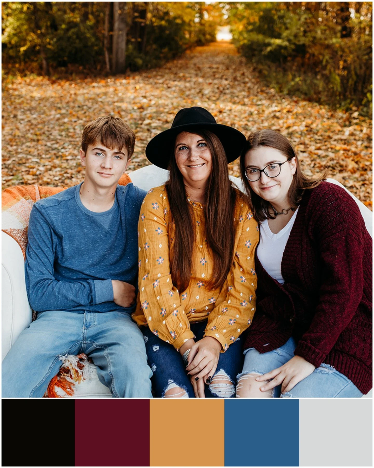


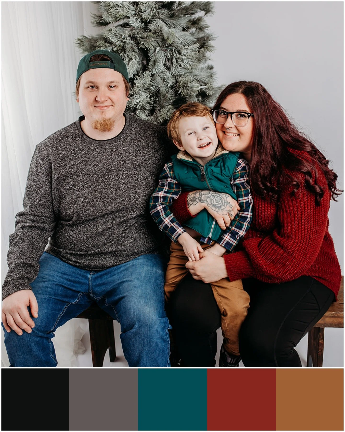
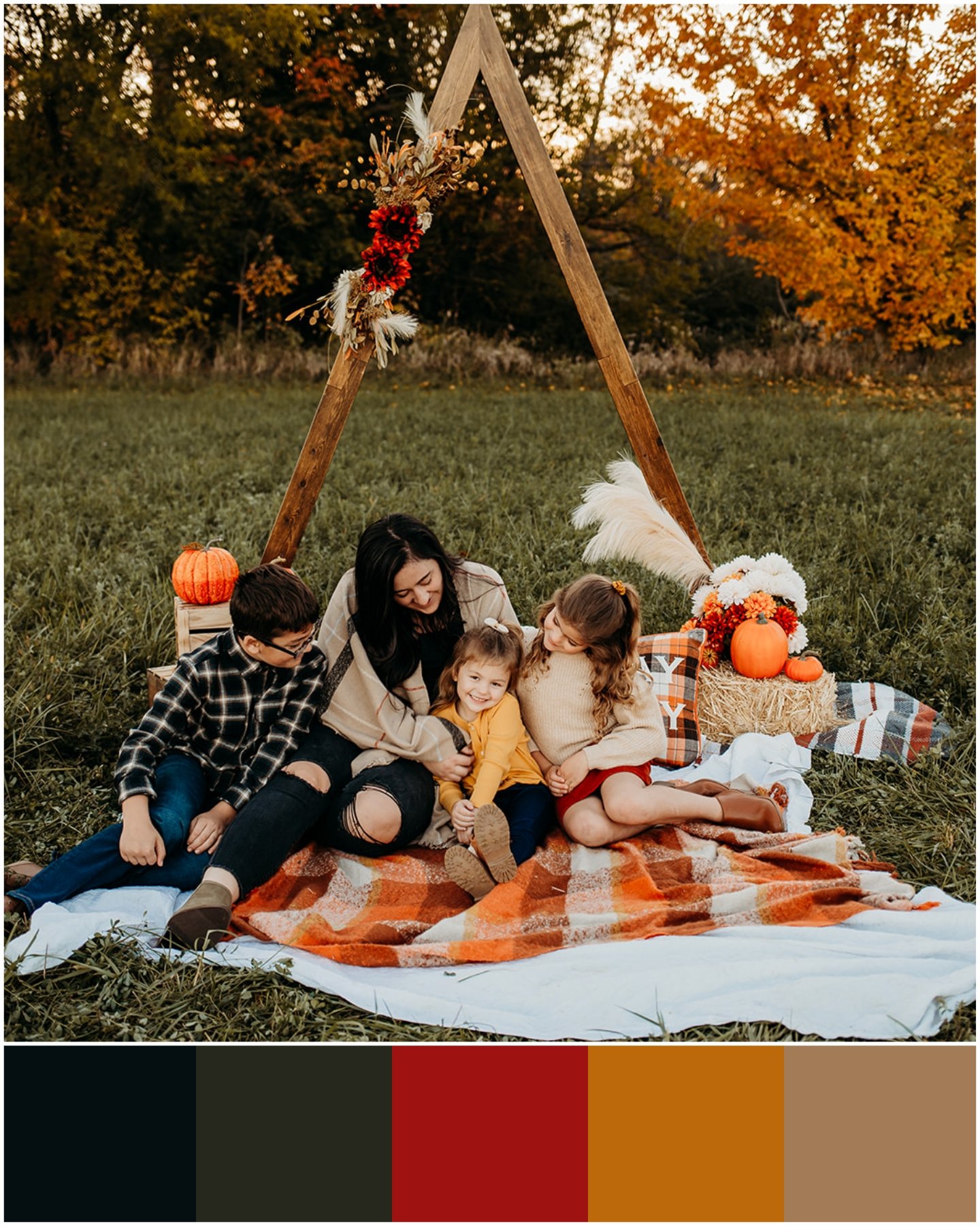
Want to get crazy with colors? Here are some great color schemes for reference. These combos are most popular during the fall and holiday season!
Again with the patterns, notice in the second photo how the mom’s flowers in her shirt match the color of her son’s shirt? That’s perfect blending! Same thing with the third photo, how the middle and youngest daughter have different versions of jean patterns. The fifth photo, how the boy is the only one in a pattern and the colors in the pattern go with mom’s shirt? again, perfect blending!


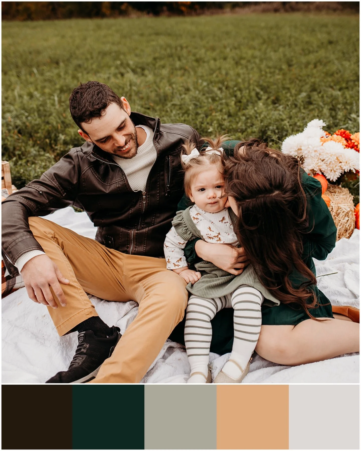
The last color group I’ll go over, neutrals. The first image is true light neutral, love how the colors blend together with the bright setting. The second image is more of dark neutral. The last photo is a mix between dark & light neutral with a pop of color. Also, to note, I love how the color of floral in the little girl’s dress matches her daddy’s shirt, perfect blending!
I truly hope this guide has helped you understand colors, patterns, textures, & blending. I hope you walk away with an idea of what you’re wanting in your family photos and as mentioned before, if you have any questions or want help or opinions on your outfits, just ask me!